News Aid
Accessibility in News Consumption
Type: UX/UI Design, Mobile Applicatino
Tools: Sketch, Figma, Illustrator, Photoshop
Accessibility in News Consumption
Type: UX/UI Design, Mobile Applicatino
Tools: Sketch, Figma, Illustrator, Photoshop

The brief was open-ended: design a mobile news app in a way that meaningfully improves the user experience. We were encouraged to explore any direction we felt would enhance how people access and engage with digital news. I chose to focus on accessibility which is often overlooked - and reimagined the news experience for users with visual or auditory impairments.
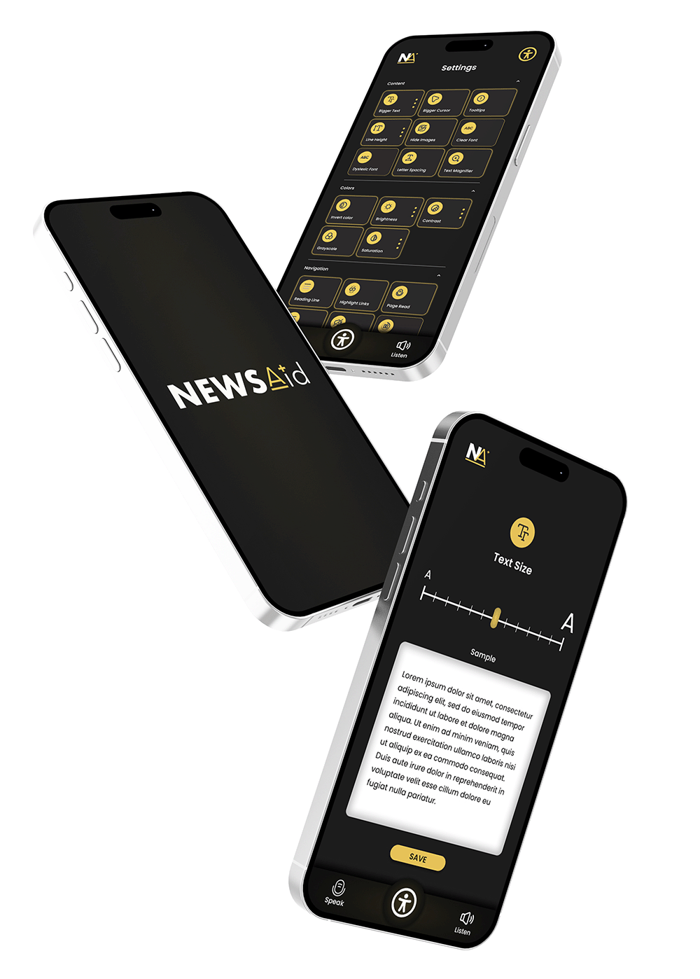
NewsAid is a mobile news app designed with accessibility at its core. Built for people with visual or auditory impairments, the app gives users complete control over how they consume content - whether through text, audio, or customised display settings. This project challenged me to think deeply about inclusive design, and how small choices in layout, typography, or colour can significantly impact someone’s ability to engage with everyday information.
The design process began with research into common barriers faced by users with sensory impairments. I reviewed existing news platforms and accessibility tools, drawing inspiration from organisations like the to understand best practices and gaps in current solutions.
From there, I mapped out essential features - including adjustable text size, colour contrast controls, image toggles, and audio playback options - and designed a modular interface that could adapt to a variety of preferences.
The settings screen gives users granular control over how content is displayed, from spacing and font size to colour themes and navigation aids.
Special attention was given to icon design, contrast ratios, and gesture-free navigation. The interface is deliberately minimal, with high-contrast visuals, large tap areas, and universally recognised icons (such as the accessibility 'man' icon) that instantly signal usability and inclusivity.


NewsAid became more than a UI project - it reinforced the responsibility designers have to make digital experiences usable for everyone. I focused on giving control back to the user, rather than trying to predict their preferences.
While there’s always more to learn when it comes to accessibility, this project gave me a deeper understanding of how inclusive thinking can be integrated into every stage of the design process. The result is a product I’m proud of - one that respects the user, adapts to their needs, and challenges the status quo of how we access information.
Adobe Illustrator (Logo design & guidelines)
Pinterest (Moodboarding)
Adobe Photoshop (Images & Mockups)
Sketch (Original Wireframing)
Figma (Prototype)
Feel free to drop me a message - whether it’s about design, your next big idea or just want to double-check what it is I actually do for a living.
If you like what you see and want to work together, get in touch!
hello@lisaallsopp.com